Sign up for the Family Tree Newsletter Plus, you’ll receive our 10 Essential Genealogy Research Forms PDF as a special thank you!
Get Your Free Genealogy Forms
"*" indicates required fields
You can inexpensively and effortlessly dress up your heritage scrapbook journaling or your family history book with computer fonts – but the choices are sometimes intimidating. A word processing program such as Microsoft Word might come with 50 fonts; then there are font CD-ROMs and free font Web sites. How do you pick lettering that enlivens your heritage pages without distracting from the photos? Just follow our tips:
Fonts come in two kinds: A serif font has short lines resembling pen strokes at the ends of the letters, and a sans serif font doesn’t. (Sans is French for “without.”) Serif fonts are considered easier to read because those little lines “connect” the letters, while sans serif fonts look more streamlined and modern.
For the bulk of your scrapbook journaling, choose classic serif fonts (such as Baskerville, Caslon, Palatino and Utopia) or easy-to-read sans serif fonts (Avant Garde, Futura, Helvetica, Optima).
Page titles and subtitles are where you can have fun with all the fancy lettering out there – just make sure the title’s easily readable. Consider your topic and the look you want to convey: serious, funny, sophisticated, cute, classic, elegant. Your word processor has fonts to suit these moods; you also can download free fonts from Web sites such as Brainy Betty <www.brainybetty.com/fonts.htm> or buy CD-ROMs such as Creating Keepsakes’ Fresh Fonts ($24.95 from <www.creatingkeepsakes.com>). Choose a headline style that contrasts with the text in appearance, size, color or weight. For example, if you picked a serif text font, go for a bold sans serif title. Or try an elegant script.
Less is more: Too many styles clutter your layout. Stick with no more than two to three fonts on one page.
Lots of bolding, underlining and words in all caps can be distracting. To emphasize a word or phrase, just italicize it.
 Golden Oldies
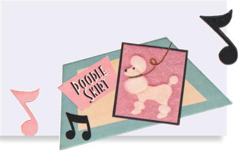
Put on your bobby socks and head over to the malt shop! Karen Foster Design’s 1950s-themed stickers set a nostalgic mood for your mid-centurypages. The acid-and lignin-free, cardstock-weight phrases, letters and ’50s icons – think jukeboxes, saddle shoes, vinyl LPs – add polished presence without too much bulk. Look for Karen Foster’s coordinating papers, too. (801) 451-9779, <www.karenfosterdesign.com>
Alternate Dimensions
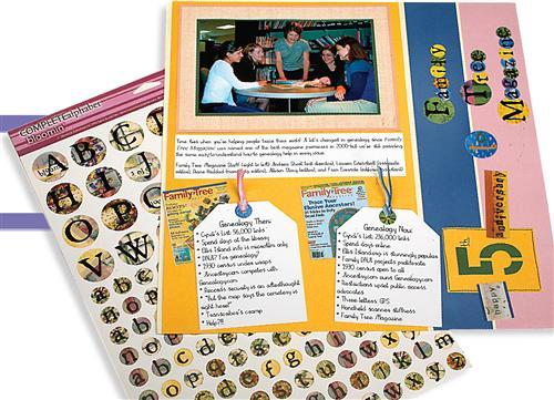
Love collage-style tags, borders and titles, but not the work required to make them? Memories Complete cardstock sticker sheets give you the layered look with alphabets (shown on the page below) and embellishments made from ribbons, buttons, beads, wire, vellum and handmade paper. All you have to do is peel, stick and you’re done. The repositionable adhesive means it’s fine to change your mind. (866) 966-6365, <www.memoriescomplete.com>
Pen Pointers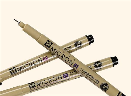
Q. What type of pigment pens would you suggest for preserving family history in a scrapbook or journal?
A. A good set of pigment-ink pens for writing photo captions and journaling is perhaps the best investment you can make to preserve your family history. Pigment ink typically resists fading and bleeding better than the dye inks in many colored pens and markers. Don’t be misled by an “acid-free” label — a pen can be acid-free and still bleed or fade in a short time.
Pens used for archival purposes also should be waterproof, which you easily can test by writing on paper, letting the ink dry (it should take less than a minute), and then trying to smudge it with water. If the ink smears, pass up the pen. Also steer clear of pens that have a noticeable odor, which indicates the presence of potentially harmful solvents that can cause staining, yellowing or fading in your photos. (That means no journaling with permanent markers!) We like Sakura’s Pigma Micron pens <www.gellyroll.com>.
Dream Weavers
Three-dimensional scrapbooking embellishments are wildly popular but may not fit into your archival-album plans. Making Memories woven labels ($4.51 per package) are a terrific (and safe) way to add a touch of texture and trendiness to your layouts. The self-adhesive clothing-style fabric labels, available in several themes, come in muted vintage-looking shades of gray, pink, blue and green. (801) 294-0430, <makingmemories.com>
 Keeping It Together
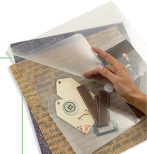
No more bent page corners or lost photos between scrapbooking sessions. Smead’s 12×12-inch polypropylene Page Manager ($7.49 per package of three) has five pockets — one for your page-in-progress and four for photos and embellishments. (651) 437-4111, <www.retrospectbysmead.com>.
SCRAP SPEAK: rhythm
A sense of visual movement guides a viewer’s eye over your scrapbook page from one photo, journaling block or other page element to the next. A layout can look stagnant without rhythm. To create it, repeat a color, shape, texture or pattern on your page — for example, mat the photos on the same color you used for the page title.
ADVERTISEMENT