Sign up for the Family Tree Newsletter Plus, you’ll receive our 10 Essential Genealogy Research Forms PDF as a special thank you!
Get Your Free Genealogy Forms
"*" indicates required fields
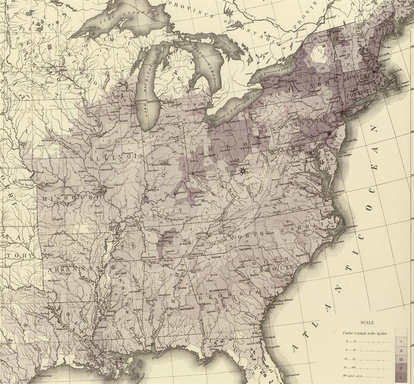
Maps often tell you a lot about the land, but little about the people who live there. Population density maps attempt to change that by indicating the average number of residents who live in a square mile.
In the map above (which is based on the 1850 federal census), varying shades of purple indicate how many people lived in a square mile, ranging from less than two residents per mile (light purple) to 90-plus (deep purple).
In addition to providing general demographic data, these maps can help you envision your ancestors’ communities.
It’s clear from the map that the Northeast had the highest population density in the country (as it does today), with large sections of New England colored a deep purple and large circles over New York City, Boston and Philadelphia, indicating those cities’ large populations.
The United States Census Bureau has created population density maps for every federal census since the late 1800s, and you can find and compare them on a convenient landing page. You can access earlier maps like the above at online collections such as the David Rumsey Map Collection.
ADVERTISEMENT
Author